A P R O M P T
- What have you learned about Pantone colors?
- When designing using Process Colors and Pantone colors what is the best fle format for a printer?
- Were you successful with designing with Pantones and will you want to design with them again?
- Screenshot your files and drop them to the blog on this post.
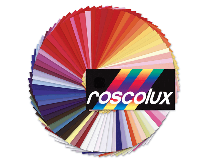
Since I was very little, I loved looking at color swatches and collections of paint chips. One time my dad gave me a sample swatch booklet of colored gels - the transparent color sheets used in photography and the film industry to change the color of light. I loved looking through this little booklet and considering all the colors! I will admit I also loved rainbows as a child an arranging things in rainbow order.
The swatch booklet looked something like this:
As I started working on my own graphics projects, I made the investment to get a pantone color swatch set. It has four booklets - Pantone Solid Coated, Pantone Solid Uncoated, Pantone CMYK Coated and Pantone CMYK Uncoated.
In the early 2000s, to print something that involved any sort of colored ink, the most cost effective way was for me to do a one-color project. At that time and at the scale I was working in, one color of ink (basic Pantone "Stock" solid colors) was cheaper than a four-color process job in CMYK. I would spend joyful hours looking at paper stocks and selecting just one color for my project, to try to maximize the excitement of printing in color. Occasionally I would pick a PMS "custom" color, but mostly picked the stock colors the printer had because it was cheaper.


This broadside, made in 2003, shows the use of purple paper and purple ink working in this methodology. A scan of it is archived online through California Revealed and can be seen at this link.
In these years I often wished I could print in full color, but it was out of my price range. In 2004 I did my first CMYK print project and made a multi-language brochure for the museum.

As time went on, changes in digital printing made it so one could print in CMYK for much cheaper (at least for at the scale I was working).
Now, it is cheaper (for my purposes) to print in CMYK rather than in one Pantone color. But I would love to make some projects using Pantone colors and play with monotone, duotones and other combinations using the beautiful crispness that Pantone Solid Colors can provide.
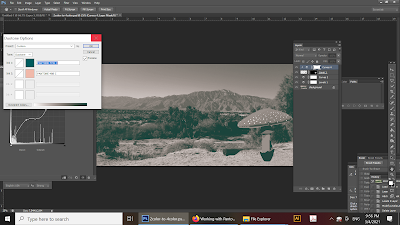
During this recent assignment I learned that, in Photoshop, the "Duotone" color method is the best way to create a Pantone based file for a printer. You can provide an Illustrator based file (i.e. eps) or a .pdf (Photoshop or Illustrator or InDesign) for a Pantone-ink based project to a printer, so long as your color settings are right.
If one were to combine CMYK with one pantone color, this would require five different inks and this would be more expensive. The more ink colors the more effort and material needed by the printer. From watching the suggested video What are Pantone Colors? I learned that certain colors cannot be reproduced exactly using only CMYK method. This is something I have noticed incidentally over the years and makes sense when I think about color mixing from my personal background in painting. Some pigments create colors that cannot be mixed with basic colors.
I would enjoy working with Pantones for the color clarity. Additional practice with curves and levels will help me know how to manipulate the possibilities offered by duotones and working with Pantone color.
This image shows one of the color swatch booklets from my childhood. I will never get tired of looking at color swatches!